Resume templates
Modern resume templates
Stand out with a contemporary design that balances visual polish with clean structure. Professional, ATS-friendly, and built to make a strong first impression.
See the templatesRecommended modern templates
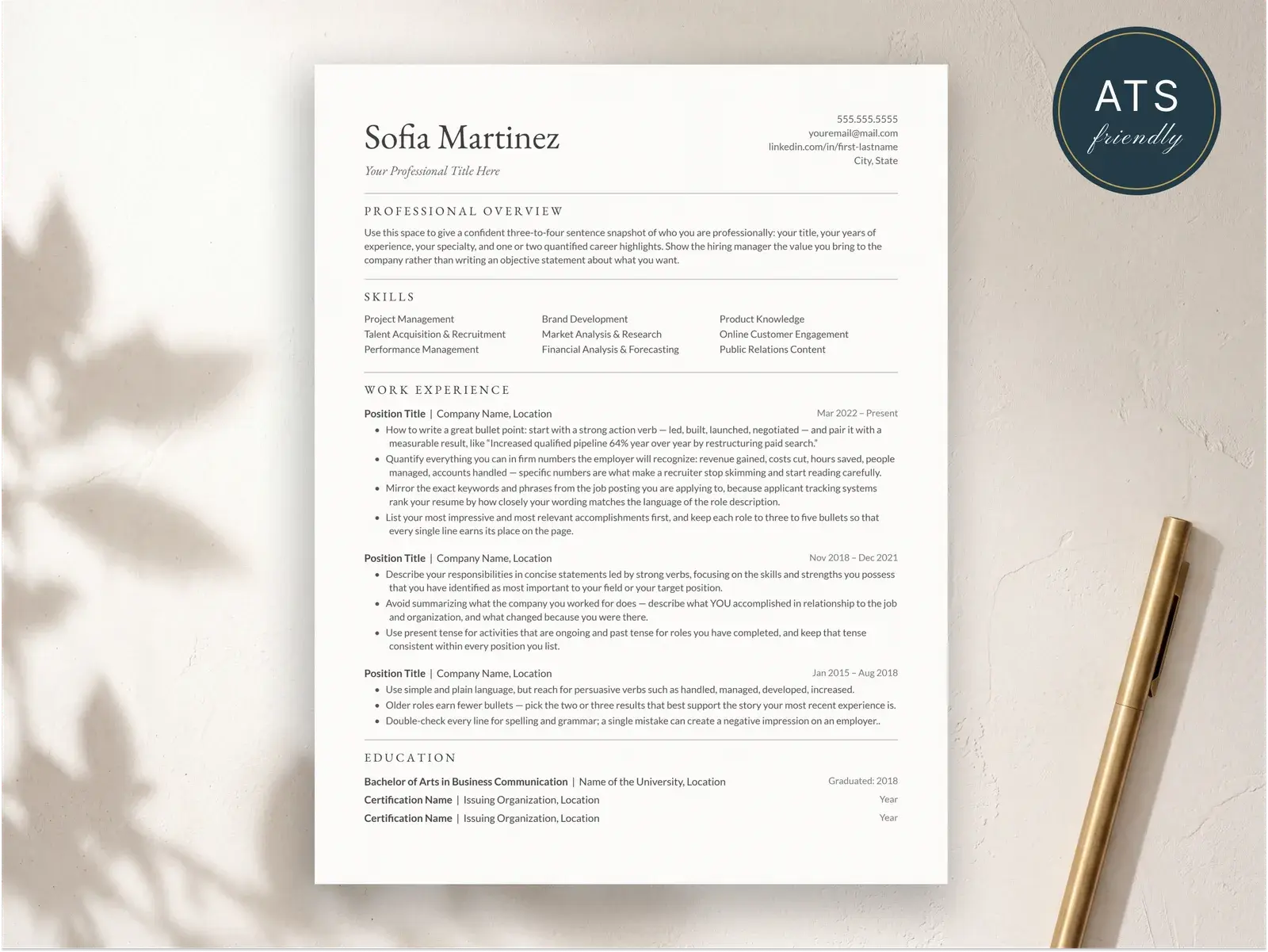
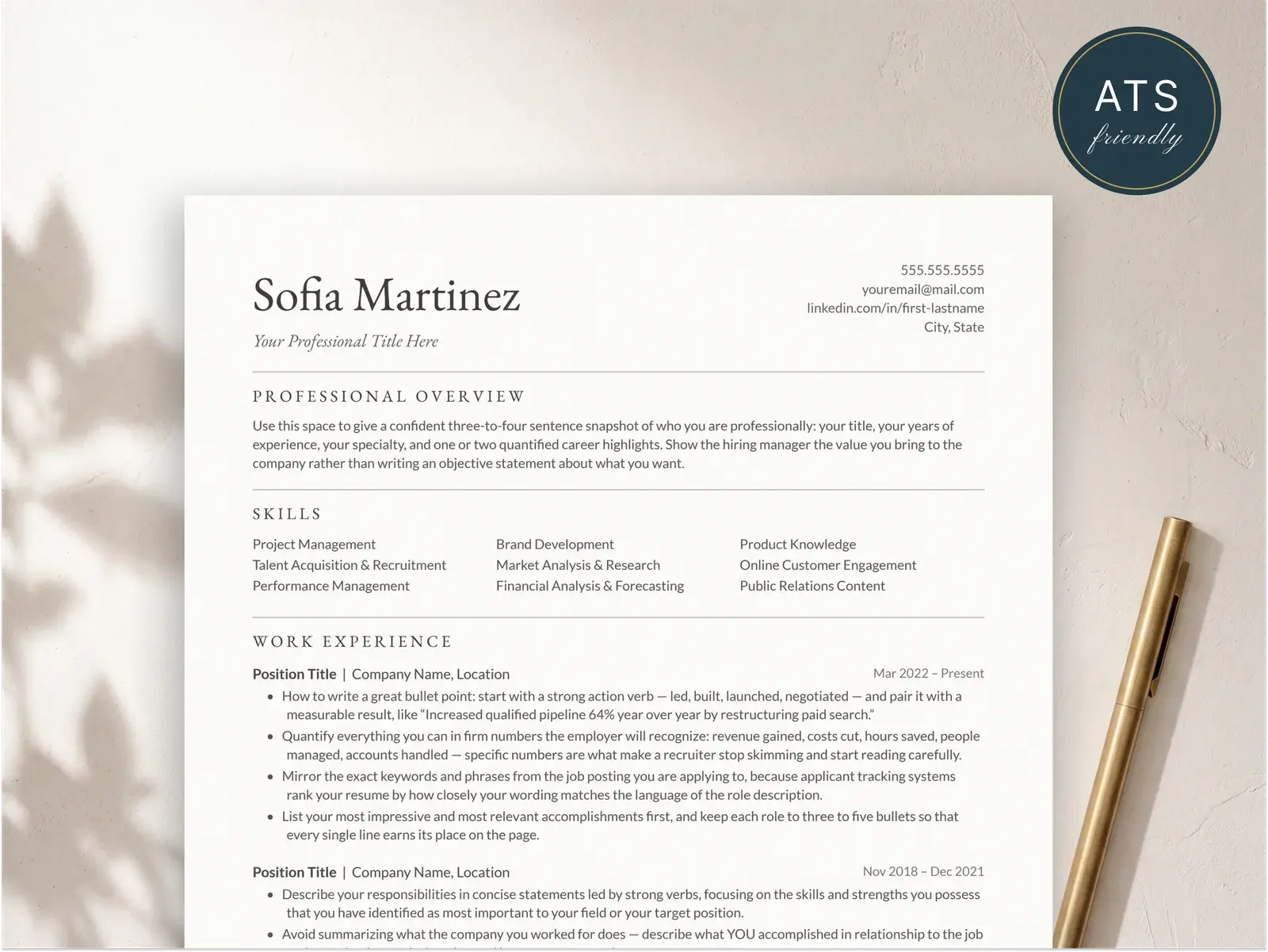
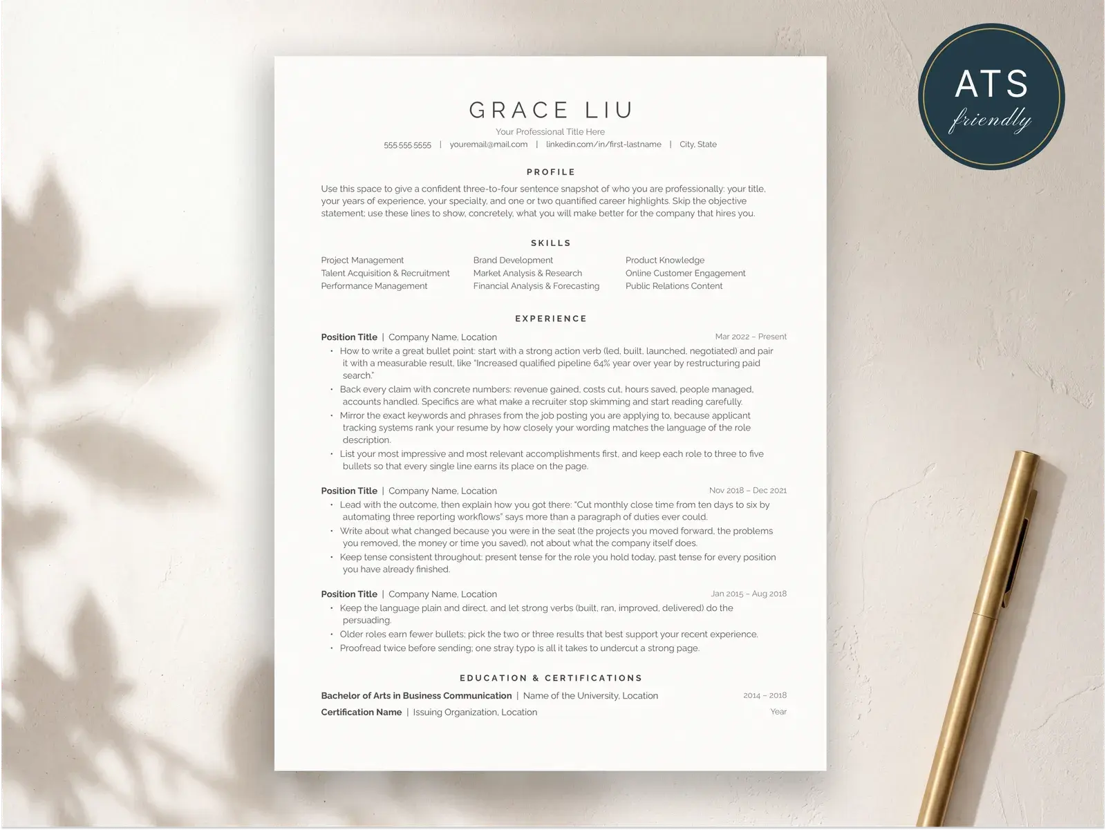
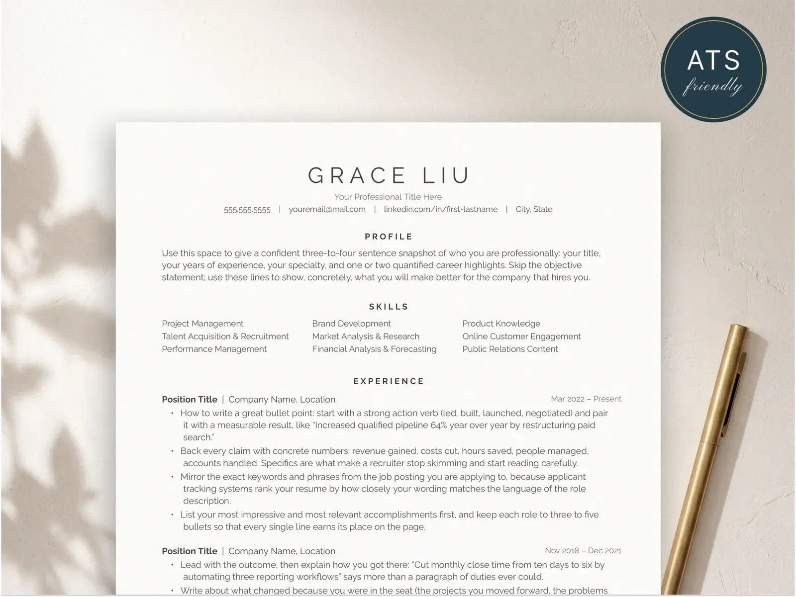
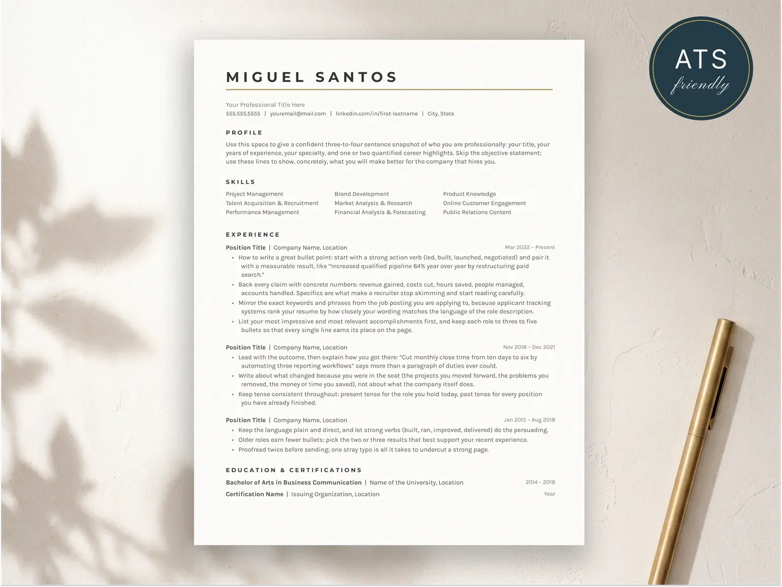
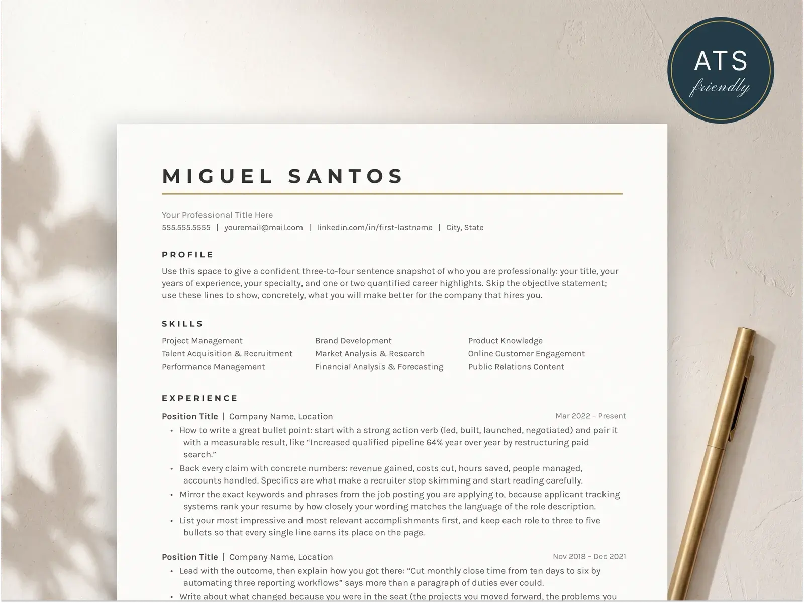
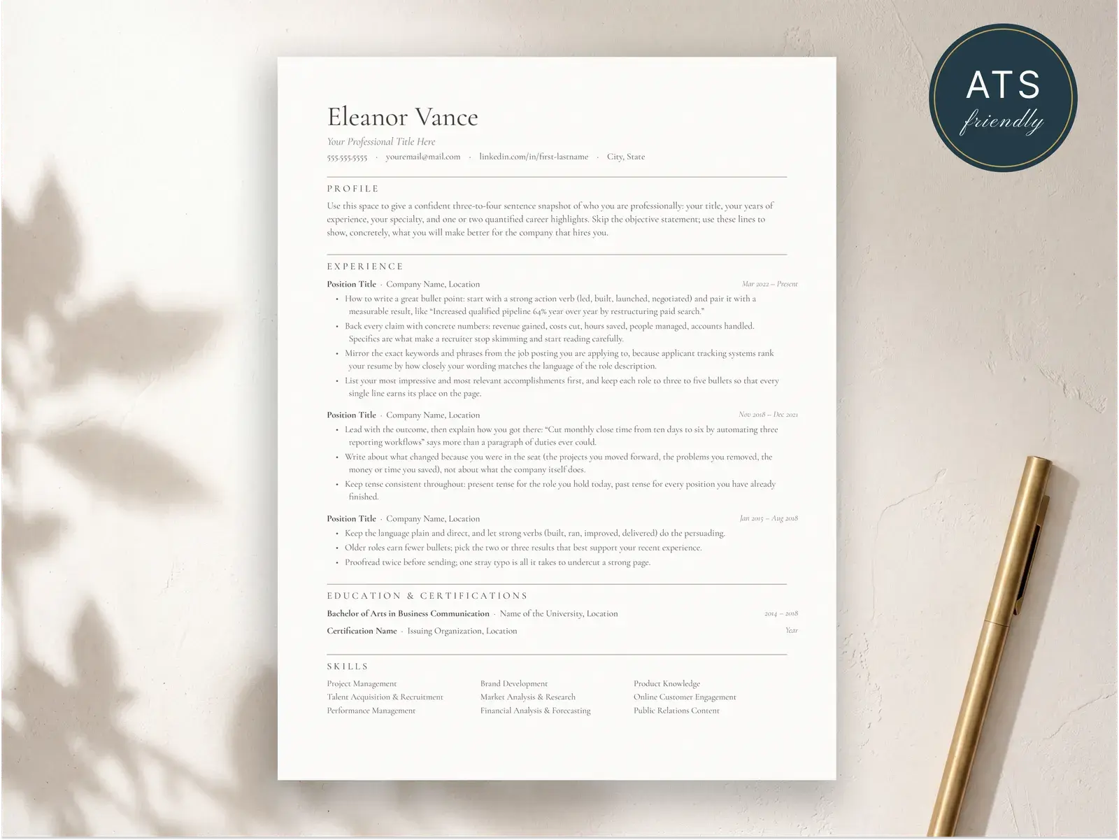
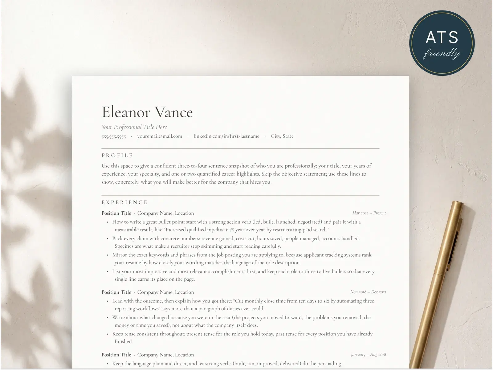
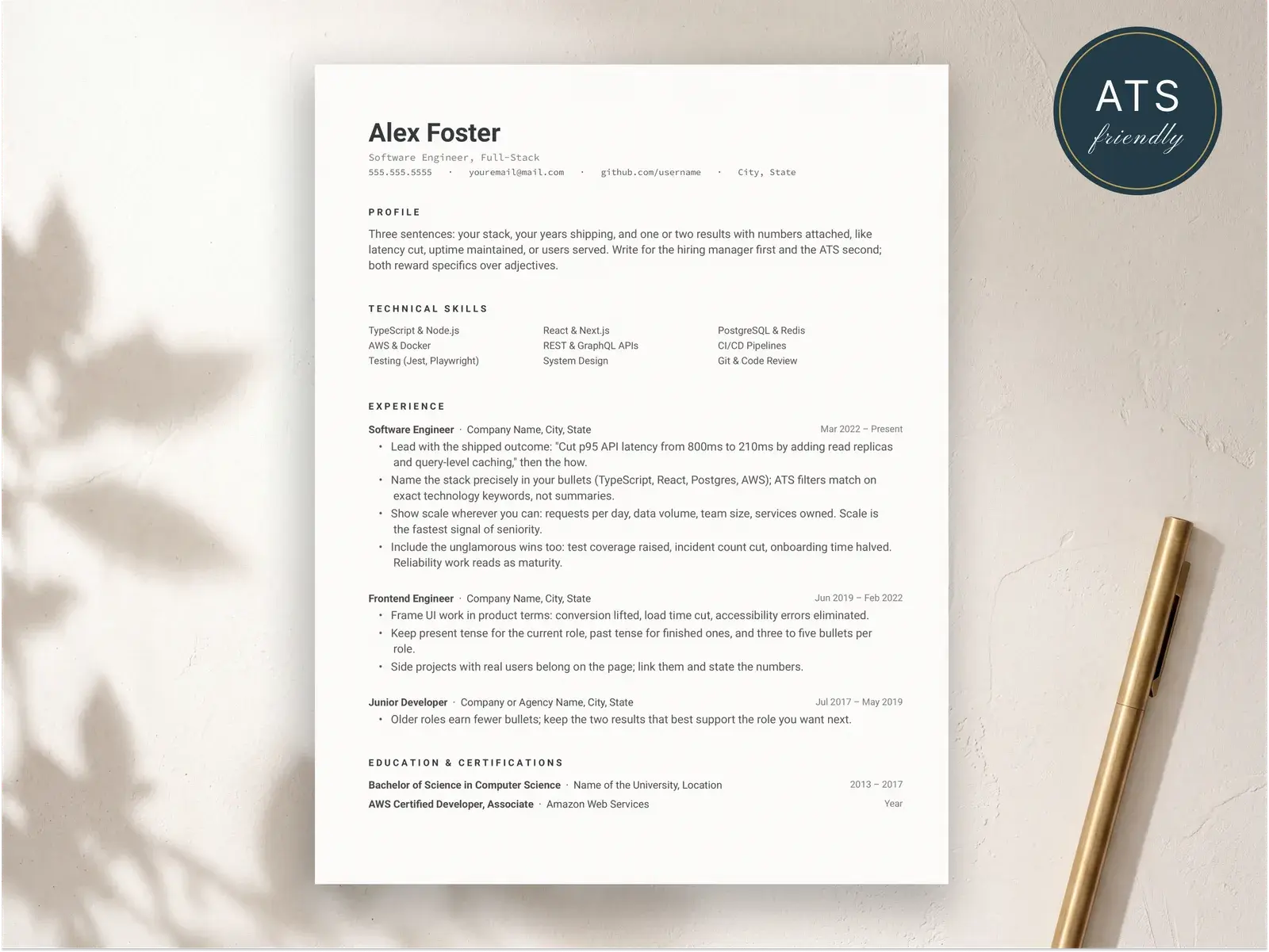
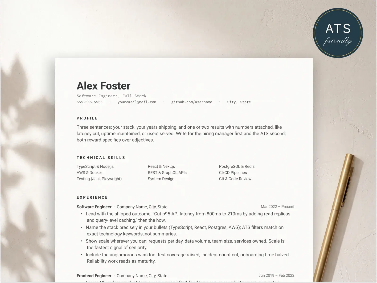
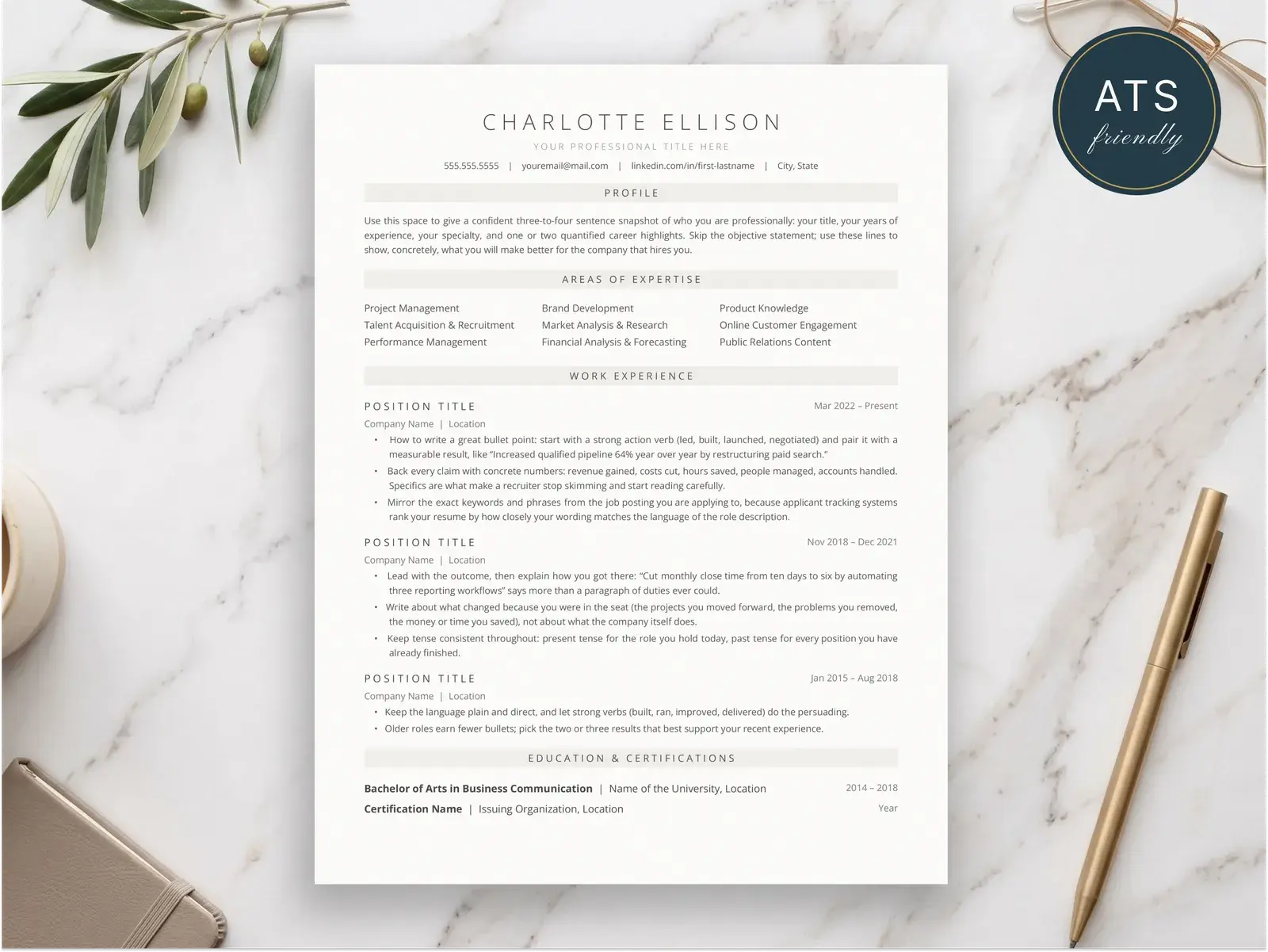
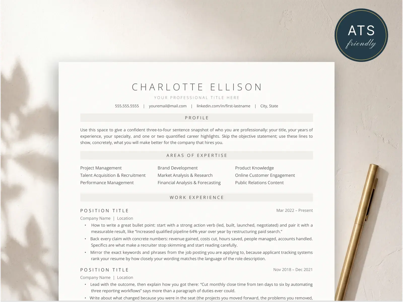
These templates use clean sans-serif typography, balanced whitespace, and subtle color accents to create a resume that feels current without sacrificing readability or ATS compatibility.
What makes a resume look modern
Choose clean, modern typography
The fastest way to date a resume is with the wrong font. Times New Roman, Cambria, and other serif defaults signal a document that hasn’t been touched in years. Modern resumes lean on clean sans-serif typefaces — Inter, Geist, Helvetica Neue, or similar — set at a comfortable size with generous line height. The goal isn’t to be trendy but to be effortlessly readable. Pair a slightly heavier weight for your name and section headings with a lighter weight for body text, and you’ll create a natural visual hierarchy without needing decorative elements, underlines, or ALL CAPS headings.
Use whitespace intentionally
Cramming every inch of the page with text is the hallmark of an outdated resume. Whitespace isn’t wasted space — it’s what makes your content scannable and your layout feel confident. Give your sections room to breathe with consistent vertical spacing between headings, entries, and bullet points. Use margins of at least 0.6 inches on all sides, and don’t be afraid of a page that’s 80% full rather than 100% packed. A recruiter scanning 50 resumes in an hour will spend more time on the one that’s easy to read than the one that tries to say everything at once.
Add subtle color accents
A single accent color can transform a black-and-white resume from generic to polished. Use it sparingly — on section headings, a thin sidebar stripe, or a subtle header background. Muted tones like slate blue, dark teal, or charcoal work across industries and print well on paper. Avoid bright reds, yellows, or neon greens that look garish on screen and worse on paper. The key is restraint: one color, used consistently, feels intentional and professional. Two or three competing colors feel like a flyer. If you’re unsure, stick with a single dark accent and let the typography and spacing carry the design.
Structure sections for quick scanning
Modern resumes are designed to be scanned, not read cover-to-cover. Each section should have a clear heading that a recruiter can spot in under a second. Within each role, lead every bullet point with a strong action verb and a measurable result — the impact should be visible in the first five words. Drop the objective statement (it tells the employer what you want, not what you offer) and replace it with a tight 2-line professional summary if you need one at all. Keep date formatting consistent, align job titles and company names on the same line, and resist the urge to add decorative borders or horizontal rules between sections. Clean separation through spacing alone looks more modern than any divider line.
Related guides for modern, editorial resumes
Reading material that pairs with this template style.
Resume examples
Ten full resumes rendered in different templates — see how editorial layouts handle the same content.
Read moreResume summary examples
Eighteen summaries you can use as the editorial opening of any modern resume.
Read moreCover letter templates
Four plain-text cover letter templates including a modern conversational version that pairs with a modern resume.
Read moreFind the right template
Instant download, edit in Google Docs, Word, or Pages — and apply knowing the layout parses cleanly in hiring systems.
Browse the collectionQuestions, answered
Are modern resume templates ATS-friendly?
Yes — as long as the template uses real selectable text, standard section headings, and a single-column or clearly structured multi-column layout. A modern design doesn't have to sacrifice ATS compatibility. The templates on BravoResume are built to pass ATS parsing while still looking polished and contemporary. Avoid templates that rely on images, text boxes, or heavy graphics, since those elements are invisible to most applicant tracking systems.
Should I use color on my resume?
A small amount of color can make your resume feel current and easier to scan. Use it strategically — a single accent color for section headings or a subtle sidebar background is enough to stand out without overwhelming the content. Stick to muted, professional tones like navy, slate blue, or charcoal rather than bright neons. The goal is to guide the reader's eye, not decorate. If you're applying to a very traditional industry, keep color to a minimum and let strong typography do the work instead.
What makes a resume look outdated?
Several design choices signal that a resume hasn't been updated in years. Objective statements at the top (replaced by professional summaries or dropped entirely), dense walls of text with no whitespace, decorative borders or clip-art icons, Times New Roman at 10pt, and two-page resumes for entry-level roles all read as dated. A modern resume uses clean sans-serif typography, generous line spacing, clear visual hierarchy, and concise bullet points that lead with measurable impact.
Can I use a modern template for a conservative industry?
Absolutely. Modern doesn't mean flashy. A modern resume for finance, law, or government simply means clean typography, structured whitespace, and consistent formatting — none of which are controversial. Avoid bold color accents or unconventional layouts if you're targeting a conservative employer, and instead lean on subtle design choices like refined font pairing, generous margins, and clear section separation. The result feels polished and professional without breaking any unwritten rules.
Is it better to use a creative or a simple resume template?
It depends on the role and industry. For most positions, a simple and well-structured template outperforms a heavily designed one because it keeps the focus on your qualifications and passes ATS screening reliably. Creative templates with infographics or non-standard layouts work best for design-focused roles where the resume itself is a portfolio piece. When in doubt, choose a clean, modern layout — it signals professionalism and attention to detail without risking readability.